Caution
This is the documentation for the current development branch of the CometVisu. It is possible that some of the described features are not yet available in the current release.
Also there might be lots of errors in this documentation as some parts of the content have been translated by an online translation service.
The switch widget
Description
The Switch Widget adds a button to the visualization. With this button, e.g. on/off switches can be realized. The behavior of the switch can be controlled via the mode of the added addresses. The normal behavior includes a change between 2 states (on / off). A click on the switch triggers a change between these states, so the value that is not active is always sent.
The switch widget contains a centered Button with optional title and subtitle below.
The switch can also behave like a trigger, i.e. it does not switch between states but always sends the same value when clicked.
As a third variant, the switch can behave like a push button and send different values when clicked and when released. An example of this behavior would be a door opener: When the button is clicked, the door opener is switched on and when the button is released, the door opener is switched off again.
Switch
For the switch mode, the switch widget must be able to read and write the current state, so a writing and a reading address are required (can also be the same). With each click, the switch toggles between the two states (on / off).
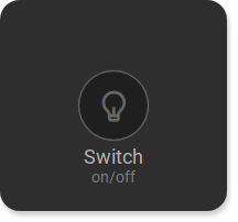
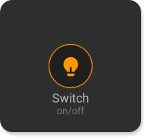
<cv-switch>
    <cv-address slot="address" transform="DPT:1.001">1/4/0</cv-address>
    <span slot="primaryLabel">Switch</span>
    <span slot="secondaryLabel">on/off</span>
</cv-switch>
Trigger
A trigger always sends the same value to the backend. It does not need to know the current state and
therefore only needs a writing address with a fixed value mode="write" value="1".
This value is also used for the mapping / styling if specified.
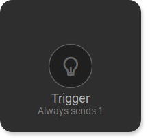
<cv-switch>
    <cv-address slot="address" transform="DPT:1.001" mode="write" value="1">1/4/0</cv-address>
    <span slot="primaryLabel">Trigger</span>
    <span slot="secondaryLabel">Always sends 1</span>
</cv-switch>
Progress bar
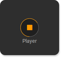
The switch widget also offers the possibility to display a circular progress bar. A possible
use case would be a switch with which a music player is controlled and the progress bar
shows how much of the current song has already been played (or alternatively the volume of the player).
The progress bar is only for information and cannot be operated itself.
For the progress bar, an additional <cv-address slot="address" element with mode="read"
and target="progress" must be added. The progress bar can display values between 0 and 100.
...
<cv-meta>
   <cv-mapping name="PlayStop">
        <entry value="0">ri-play-fill</entry>
        <entry value="1">ri-stop-fill</entry>
    </cv-mapping>
</cv-meta>
...
<cv-switch mapping="PlayStop">
    <cv-address slot="address" transform="DPT:1.001" value="1">1/4/0</cv-address>
    <cv-address slot="address" transform="DPT:5.001" mode="read" target="progress">1/4/1</cv-address>
    <span slot="primaryLabel">Player</span>
    <span slot="secondaryLabel"/>
</cv-switch>
Allowed attributes in the switch element
Element |
Attribute |
|||
|---|---|---|---|---|
Name |
Content |
Description |
||
cv-switch |
styling |
string |
Change the color of the displayed value depending on its value. See also styling |
|
mapping |
string |
Map the bus value to a different value, text or symbol for displaying. See also mapping |
||
size |
button, 0.5x0.5, 1x0.5, 1x1, 2x1, 2x1.5, 1x2, 2x2, 2x4 or 4x2 |
Size of the tile in {columns}x{rows}, 1x1 is the default size. |
||
button-size |
small, normal or large |
Defines the button size. |
||
progress-mapping |
string |
Map the bus value to a value between 0 and 100 to display a progress mapping |
||
whole-tile |
true or false |
Augments the clickable area to the whole tile. |
||
on-value |
string |
Value of the “on” state. Defaults to “1”. |
||
off-value |
string |
Value of the “off” state. Defaults to “0”. |
||
visible-on |
mobile or desktop |
Controls this element’s visibility by screen size. |
||
class |
string |
Add this value to the CSS class so that it can be formatted by a user provided style sheet. |
||
style |
string |
Custom CSS style rules for this widget. |
||
Allowed child elements and their attributes
Element |
Attribute |
|||
|---|---|---|---|---|
Structure |
Name |
Content |
Description |
|
|
slot |
address or tileAddress |
||
transform |
string |
Defines the datatype in the backend, e.g. DPT:1.001 for KNX datapoint type 1.001. |
||
mode |
disable, read, write or readwrite |
Defines if this address is only used to |
||
value |
string |
Fixed value sent to this address. |
||
on |
click, down or up |
Event on which a |
||
target |
string |
Target in the parent widget the value if this address should be use for. The possible values depend on the parent widget. |
||
format-pos |
decimal |
Position for format string when multiple addresses are used. |
||
qos |
decimal |
Only MQTT: QoS |
||
retain |
true or false |
Only MQTT: retain flag |
||
selector |
string |
Only MQTT: JSON selector |
||
backend |
string |
Optional name of the backend this address belongs to. |
||
mapping |
string |
Map the bus value to a different value, text or symbol for displaying. See also mapping |
||
format |
string |
Formatting of the value (printf syntax). |
||
delay |
positiveInteger |
Optional delay in milliseconds that a write-request to this address is delayed. |
||
send-mode |
on-change or always |
Usually the elements that are using this address receive an update-event only when that value hast changed ( |
||
Element |
Attribute |
|||
|---|---|---|---|---|
Structure |
Name |
Content |
Description |
|
|
size |
small, large, x-large, xx-large or xxx-large |
Defines the size of the icon. |
|
color |
string |
Icon color. |
||
visible-on |
mobile or desktop |
Controls this element’s visibility by screen size. |
||
class |
string |
Add this value to the CSS class so that it can be formatted by a user provided style sheet. |
||
style |
string |
Custom CSS style rules for this widget. |
||
|
string |
|||
Element |
Attribute |
|||
|---|---|---|---|---|
Structure |
Name |
Content |
Description |
|
|
slot |
primaryLabel or secondaryLabel |
||
tr |
true or false |
Defines that the text content of this element should be translated. |
||
|
string |
|||
