Caution
This is the documentation for the current development branch of the CometVisu. It is possible that some of the described features are not yet available in the current release.
Also there might be lots of errors in this documentation as some parts of the content have been translated by an online translation service.
The link widget
Description
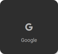
The link widget opens a URL in a new tab or the same page. It consists of an icon and an optional text.

<cv-link href="https://www.google.de">
    <cv-icon slot="icon">ri-google-fill</cv-icon>
    <span slot="label">Google</span>
</cv-link>
As an alternative, an image can also be used:
<cv-link href="https://www.google.de">
    <cv-image slot="icon" src="resources/config/media/image.png" />
    <span slot="label">Google</span>
</cv-link>
Allowed attributes
Element |
Attribute |
|||
|---|---|---|---|---|
Name |
Content |
Description |
||
cv-link |
size |
button, 0.5x0.5, 1x0.5, 1x1, 2x1, 2x1.5, 1x2, 2x2, 2x4 or 4x2 |
Size of the tile in {columns}x{rows}, 1x1 is the default size. |
|
href |
anyURI |
URL of the link. |
||
target |
_blank or _self |
Controls where the link should be opened. |
||
visible-on |
mobile or desktop |
Controls this element’s visibility by screen size. |
||
class |
string |
Add this value to the CSS class so that it can be formatted by a user provided style sheet. |
||
style |
string |
Custom CSS style rules for this widget. |
||
Allowed child elements and their attributes
Element |
Attribute |
|||
|---|---|---|---|---|
Structure |
Name |
Content |
Description |
|
|
src |
string |
||
refresh |
decimal |
Time interval in seconds this widget is being refreshed. |
||
visible-on |
mobile or desktop |
Controls this element’s visibility by screen size. |
||
class |
string |
Add this value to the CSS class so that it can be formatted by a user provided style sheet. |
||
style |
string |
Custom CSS style rules for this widget. |
||
proxy |
true or false |
Use a proxy to avoid loading errors or credentials from the hidden config. |
||
auth-type |
basic or bearer |
Type of authentication, if needed. |
||
config-section |
string |
Use uri and credentials from this section of the hidden config. |
||
username |
string |
Username for authentication (or token for auth-type=bearer). |
||
password |
string |
Password for authentication. |
||
self-signed |
true or false |
Disable certificate validation to allow loading pages with self-signed certificates. |
||
|
transform |
string |
Transformation of the bus system value to be shown. |
|
mode |
disable, read, write or readwrite |
“disable” deactivates the communication, “read” will only fetch data from the backend, “write” will only write to it and an address with “readwrite” will be both, read from and written to. |
||
variant |
string |
|||
format-pos |
decimal |
Position for format string when multiple addresses are used. |
||
selector |
string |
Only MQTT: JSON selector |
||
qos |
decimal |
Only MQTT: QoS |
||
retain |
true or false |
Only MQTT: retain flag |
||
ignore-error |
true or false |
Only MQTT: ignore decode errors. |
||
|
string |
The GA (like: 12/0/7) for KNX-backends, the item name for openHAB-backend or the MQTT topic |
||
Element |
Attribute |
|||
|---|---|---|---|---|
Structure |
Name |
Content |
Description |
|
|
size |
small, large, x-large, xx-large or xxx-large |
Defines the size of the icon. |
|
color |
string |
Icon color. |
||
visible-on |
mobile or desktop |
Controls this element’s visibility by screen size. |
||
class |
string |
Add this value to the CSS class so that it can be formatted by a user provided style sheet. |
||
style |
string |
Custom CSS style rules for this widget. |
||
|
string |
|||
Element |
Attribute |
|||
|---|---|---|---|---|
Structure |
Name |
Content |
Description |
|
|
slot |
string |
||
tr |
true or false |
Defines that the text content of this element should be translated. |
||
|
string |
|||