Caution
This is the documentation for the current development branch of the CometVisu. It is possible that some of the described features are not yet available in the current release.
Also there might be lots of errors in this documentation as some parts of the content have been translated by an online translation service.
Popup
The popup component can be used to display widgets within a popup. The popup is centered as a window above the current content and is usually not visible. It is made visible either by user interaction such as a click or by incoming data from the backend.
Details to a status
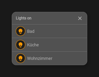
A use case arises in connection with a status widget where the status widget provides a summary such as x lights switched on and when clicked on the widget then a popup is opened in which all switched on lights are listed. Within the popup a list is used.

Status widget, popup closed

Status popup
...
<cv-meta>
    <cv-mapping name="light">
        <entry value="0">ri-lightbulb-line</entry>
        <entry value="1">ri-lightbulb-fill</entry>
    </cv-mapping>
    <cv-styling name="button">
        <entry value="1">active</entry>
        <entry value="0">inactive</entry>
    </cv-styling>
</cv-meta>
...
<cv-status format="%d on">
    <cv-icon slot="icon" size="x-large">ri-lightbulb-line</cv-icon>
    <cv-address slot="address" transform="OH:number" mode="read" backend="main">number:Lights</cv-address>
    <span slot="label">Lights</span>
    <cv-popup slot="popup" modal="true">
        <cv-list rowspan="3" colspan="3">
            <model filter="item.active===true" sort-by="label">
                <cv-address transform="raw" mode="read">members:Lights</cv-address>
            </model>
            <header>
                <h4>Lights on</h4>
            </header>
            <template>
                <cv-listitem>
                    <cv-button class="round-button" mapping="light" size="small">
                        <cv-address mode="readwrite" transform="OH:switch">${name}</cv-address>
                        <cv-icon class="value"/>
                    </cv-button>
                    <div class="content">
                        <label class="primary">${label}</label>
                    </div>
                </cv-listitem>
            </template>
            <template when="empty">
                <li><label class="primary">Currently all lights are switched off</label></li>
            </template>
        </cv-list>
    </cv-popup>
</cv-status>
Open on status update
Popups can also open themselves when a certain value is received at an address. For example, the image of a camera at the front door can be displayed in a popup when the doorbell rings.
<cv-page>
    <cv-popup modal="true" style="padding: 0" auto-close-timeout="120">
        <cv-image style="width: 470px" src="http://localhost/camera/picture" refresh="2" />
        <cv-button class="bottom green overlay">
            <cv-address mode="readwrite" transform="DPT:1.001" on="down" value="1">1/4/0</cv-address>
            <cv-address mode="write" transform="DPT:1.001" on="up" value="0">1/4/0</cv-address>
            <label class="primary value">Open</label>
        </cv-button>
        <cv-address mode="read" transform="DPT:1.001" target="open">1/4/2</cv-address>
    </cv-popup>
<cv-page>
The popup includes an Image with a low refresh rate of only 2 seconds.
Above the image a Button is displayed that sends the value “1” to address “1/4/0”
when the mouse is pressed (on="down" value="1") and the value “0” when released (on="up" value="0").
The popup opens when the value “1” is received at address “1/4/2” (target="open").
If the popup should also close when the value “0” is received, target="open-close" must be used.
Allowed attributes
Element |
Attribute |
|||
|---|---|---|---|---|
Name |
Content |
Description |
||
cv-popup |
modal |
true or false |
Disables the background while the popup is open. |
|
fullscreen |
true or false |
Open the popup in fullscreen mode. |
||
title |
string |
Headline of this popup. |
||
auto-close-timeout |
integer |
Time in seconds when the popup is automatically closed. |
||
visible-on |
mobile or desktop |
Controls this element’s visibility by screen size. |
||
class |
string |
Add this value to the CSS class so that it can be formatted by a user provided style sheet. |
||
style |
string |
Custom CSS style rules for this widget. |
||