Caution
This is the documentation for the current development branch of the CometVisu. It is possible that some of the described features are not yet available in the current release.
Also there might be lots of errors in this documentation as some parts of the content have been translated by an online translation service.
The energy widget
Description
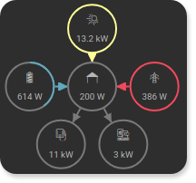
With the energy widget, energy flows within a house can be displayed.
In the standard configuration, the widget shows current values of electrical power (Watt)
and their flow direction for the following types: photovoltaic inverter, battery storage, various consumers
and the main power meter. These elements are displayed if you add a <cv-address> for
the corresponding slot. A complete example would look like this:
<cv-energy>
    <cv-address slot="pv-power" transform="DPT:12.001" mode="read">1/4/27</cv-address>
    <cv-address slot="battery-power" transform="DPT:13.001" mode="read">1/4/42</cv-address>
    <cv-address slot="battery-other" transform="DPT:5.001" mode="read" target="progress">1/4/43</cv-address>
    <cv-address slot="grid-power" transform="DPT:13.001" mode="read">1/4/25</cv-address>
    <cv-address slot="charger-power" transform="DPT:12.001" mode="read">1/4/44</cv-address>
    <cv-address slot="heatpump-power" transform="DPT:12.001" mode="read">1/4/45</cv-address>
</cv-energy>
Here you can see two major consumers in the form of an ev-charger consuming 11kW and a heat pump consuming 3kW. The 200W shown in the middle is the remaining house consumption and is automatically calculated as the difference between the sum of the consumption and supply power (13200 + 614 + 386 - 11000 - 3000 = 200).
The flow direction of the energy is indicated by the arrowheads and also by color change.
The color scheme defines colors for PV generation (--pvColor), battery charging (--batteryInjectColor),
battery discharging (--batteryConsumeColor), grid consumption (--gridConsumeColor) and grid injection (--gridInjectColor).
These are defined as CSS variables and can be easily changed by a CSS style.
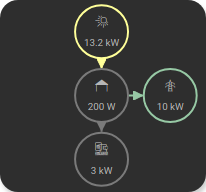
If you don’t have an ev-charger or battery storage, these values will not be displayed:
<cv-energy>
    <cv-address slot="pv-power" transform="DPT:12.001" mode="read">1/4/27</cv-address>
    <cv-address slot="grid-power" transform="DPT:13.001" mode="read">1/4/25</cv-address>
    <cv-address slot="heatpump-power" transform="DPT:12.001" mode="read">1/4/45</cv-address>
</cv-energy>
Possible customizations
The previously described usage of the energy widget with <cv-address slot="... is just for simple, quick use and only covers
some standard use cases. However, it is possible to create a completely custom layout. You can freely place and configure
the <cv-power-entity> elements used in the energy widget. If you don’t specify any addresses, you have an empty widget,
the only thing that is automatically added as soon as there is at least one other element is the house in the middle.
Simple example
As a simple example, let’s display a balcony power plant and the main power meter. Since this, together with the house,
are only 3 elements, a widget with half height is sufficient size="1x0.5".

<cv-energy size="1x0.5" rows="1" view-box="0 0 3 1" house-row="0">
    <cv-power-entity type="pv" connect-to="house" row="0" column="0">
        <cv-address transform="DPT:12.001" mode="read">1/4/27</cv-address>
    </cv-power-entity>
    <cv-power-entity type="grid" id="grid" connect-to="house" row="0" column="2">
        <cv-address transform="DPT:13.001" mode="read">1/4/25</cv-address>
    </cv-power-entity>
</cv-energy>
The changed size needs a few additional adjustments. First, we only need one row for the 3 elements row="1"
(the default value is 3 rows and 3 columns). Also, the viewBox needs to be adjusted, which specifies the visible area of the widget.
The first two values specify the starting column and row of the visible area and the last two the displayed columns and rows from the start.
The view-box="0 0 3 1" shows the entire area of a layout with 3 columns and one row.
Finally, the position of the house must be changed, it is always placed in column 1 and row 1 (which is the center for a 3x3 layout,
since counting always starts at 0). Since we only have one row here, we position the house in this house-row="0".
Determination of the “flow direction”
Some power values can also become negative and thus define the flow direction. If the main meter, for example, outputs a negative value, this means that this power is currently being fed into the grid. A positive value means that this power is currently being drawn from the grid. For a battery storage, the value can also become negative when the battery is being charged. PV and consumer meters usually only deliver positive values, even if they represent different directions when directly compared (generation vs. consumption).
The representation of the energy flows between two elements is defined via the connect-to attribute.
The network (<cv-power-entity type="grid" id="grid">) is connected to the house by connect-to="house".
A positive value then means that the energy flows from the network to the house (grid reference) and a negative
value means that the energy flows from the house to the network (grid feed-in).
The same applies to the inverter (<cv-power-entity type="pv">), but here only positive values can occur,
which then flow towards the house.
Hint
As already mentioned, consumer meters also only deliver positive values, even though technically
energy flows from the house to a consumer. Therefore, the connection of a consumer to the house must be specified
with connect-from="house".
Complex example
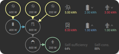
The adjustment in the other direction, by providing a larger widget with more columns, of course also works. For the following explanation, an extended setup consisting of a battery storage with its own PV input, a hybrid inverter with 2 PV inputs to which the battery storage is also connected and of course the main meter should be displayed. In addition, not only the current power values but also the energy values of the current day should be displayed, including the self-consumption value and the degree of self-sufficiency. For this purpose, the widget is enlarged and provided with 6 columns.
<cv-energy size="2x1" columns="6" view-box="0 0 6 3" house-row="2" center-x="false">
    <cv-power-entity id="battery-pv" type="pv" icon="knxuf-scene_solar_panel" connect-to="battery" row="0" column="0">
        <cv-address transform="DPT:12.001" mode="read">1/4/26</cv-address>
    </cv-power-entity>
    <cv-power-entity id="pv1" type="pv" icon="knxuf-scene_solar_panel" connect-to="inverter" row="0" column="1">
        <cv-address transform="DPT:12.001" mode="read">1/4/27</cv-address>
    </cv-power-entity>
    <cv-power-entity id="pv2" type="pv" icon="knxuf-scene_solar_panel" connect-to="inverter" row="0" column="2">
        <cv-address transform="DPT:12.001" mode="read">1/4/28</cv-address>
    </cv-power-entity>
    <cv-power-entity type="battery" id="battery" connect-to="inverter" row="1" column="0">
       <cv-address transform="DPT:13.001" mode="read">1/4/42</cv-address>
       <cv-address transform="DPT:5.001" mode="read" target="progress">1/4/43</cv-address>
    </cv-power-entity>
    <cv-power-entity icon="knxuf-scene_power_inverter" id="inverter" connect-to="house" row="1" column="1">
        <cv-address transform="DPT:13.001" mode="read">1/4/30</cv-address>
    </cv-power-entity>
    <cv-power-entity type="grid" id="grid" connect-to="house" row="2" column="2">
        <cv-address transform="DPT:13.001" mode="read">1/4/25</cv-address>
    </cv-power-entity>

    <cv-energy-entity id="pv-today" type="pv" row="0" column="3">
        <cv-address transform="DPT:13.013" mode="read">1/1/1</cv-address>
    </cv-energy-entity>
    <cv-energy-entity id="consumed-today" type="consumer" icon="knxuf-control_building_empty" row="1" column="3">
        <cv-address transform="DPT:13.013" mode="read">1/1/2</cv-address>
    </cv-energy-entity>
    <cv-energy-entity id="battery-consume-today" type="battery" row="0" column="4" direction="incoming">
        <cv-address transform="DPT:13.013" mode="read">1/1/3</cv-address>
    </cv-energy-entity>
    <cv-energy-entity id="battery-inject-today" type="battery" row="1" column="4" direction="outgoing">
        <cv-address transform="DPT:13.013" mode="read">1/1/4</cv-address>
    </cv-energy-entity>
    <cv-energy-entity id="grid-consume-today" type="grid" row="0" column="5" direction="incoming">
        <cv-address transform="DPT:13.013" mode="read">1/1/5</cv-address>
    </cv-energy-entity>
    <cv-energy-entity id="grid-inject-today" type="grid" row="1" column="5" direction="outgoing">
        <cv-address transform="DPT:13.013" mode="read">1/1/6</cv-address>
    </cv-energy-entity>
    <cv-svg-text-value format="%d%%" row="2" column="3" colspan="1.5" title="Self-sufficiency">
        <!-- math.round(100.0 * (PV_Energy_Today - Energy_Grid_Export_Today) / (Energy_Grid_Import_Today + PV_Energy_Today)) -->
        <cv-address-group operator="/" round="true" factor="100">
            <cv-address-group operator="-">
                <cv-address transform="DPT:13.013" mode="read">1/1/2</cv-address>
                <cv-address transform="DPT:13.013" mode="read">1/1/6</cv-address>
            </cv-address-group>
            <cv-address-group operator="+">
                <cv-address transform="DPT:13.013" mode="read">1/1/2</cv-address>
                <cv-address transform="DPT:13.013" mode="read">1/1/5</cv-address>
            </cv-address-group>
        </cv-address-group>
    </cv-svg-text-value>
    <cv-svg-text-value format="%d%%" row="2" column="4.5" colspan="1.5" title="Self-cons.">
        <!-- math.round(100.0 * (PV_Energy_Today - Energy_Grid_Export_Today) / PV_Energy_Today) -->
        <cv-address-group operator="/" round="true" factor="100">
            <cv-address-group operator="-">
                <cv-address transform="DPT:13.013" mode="read">1/1/2</cv-address>
                <cv-address transform="DPT:13.013" mode="read">1/1/6</cv-address>
            </cv-address-group>
            <cv-address transform="DPT:13.013" mode="read">1/1/2</cv-address>
        </cv-address-group>
    </cv-svg-text-value>
</cv-energy>
The adjustment of size, number of columns and viewBox is done exactly as in the simple example. New here is only the
specification center-x="false". This deactivates the automatic horizontal centering of the contents of the first and last
column.
The daily energy values are represented by the <cv-energy-entity> elements. In the top line you can see the energy
generated today by the PV modules, discharged from the battery and drawn from the grid. In the second line you can see the
energy consumed today, charged into the battery and fed into the grid. The same color scheme as for the power values is used.
The lowest line shows the self-sufficiency value (how much of the consumed energy was self-generated) and the self-consumption rate.
Both values are calculated from the values in the two upper lines.
For the representation of the values as simple, formatted text with a title, a <cv-svg-text-value> element is used.
Alternative display options
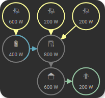
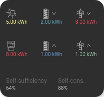
With the already mentioned ViewBox attribute, you have the possibility to make only a part of the widget content visible. This way you can set the size of the widget back to the standard size, which only shows the power values. The daily values are accessible by scrolling within the widget.
Initial view |
View after clicking on the right border |
<cv-energy columns="6" view-box="0 0 3 3" house-row="2" center-x="false">
...
Here only the size attribute was removed and the 3rd number in the view-box attribute was changed,
so that only 3 columns are displayed in a widget in standard size. Navigation within the widget
can be done either by direct scrolling or by clicking on invisible areas on the right and left edge.
A double click always brings you back to the initial view.
Fullscreen view
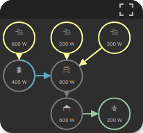
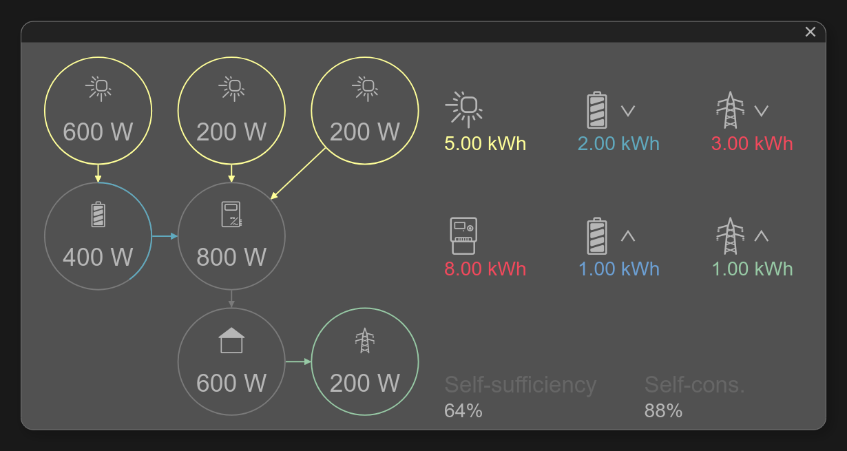
Another possibility to see more details is offered by the fullscreen view of the widget.
Initial view |
Fullscreen view |
<cv-energy columns="6" view-box="0 0 3 3" fullscreen-view-box="0 0 6 3" house-row="2" center-x="false" allow-fullscreen="true">
...
If you don’t want the header area with the button to open the fullscreen view to take up valuable space, you can also hide it. Then it will only be displayed when you move the mouse pointer over this area (or click in this area on a touchscreen).
<cv-energy columns="6" view-box="0 0 3 3" house-row="2" center-x="false" allow-fullscreen="true" header="auto-hide">
...
Allowed attributes in the energy element
Element |
Attribute |
|||
|---|---|---|---|---|
Name |
Content |
Description |
||
cv-energy |
size |
button, 0.5x0.5, 1x0.5, 1x1, 2x1, 2x1.5, 1x2, 2x2, 2x4 or 4x2 |
Size of the tile in {columns}x{rows}, 1x1 is the default size. |
|
mobile-size |
button, 0.5x0.5, 1x0.5, 1x1, 2x1, 2x1.5, 1x2, 2x2, 2x4 or 4x2 |
Size of the tile in {columns}x{rows}, 1x1 is the default size. |
||
view-box |
string |
Viewbox of the grid (start-column start-row columns rows). |
||
fullscreen-view-box |
string |
Viewbox of the grid in fullscreen(start-column start-row columns rows). |
||
pan |
true or false |
If only a part of the energy-grid is shown, this flag activates scrolling inside the grid. |
||
rows |
integer |
Number of rows used to lay out the content. |
||
columns |
integer |
Number of columns used to lay out the content. |
||
cell-width |
integer |
Width of a single cell in the layout. |
||
cell-height |
integer |
Height of a single cell in the layout. |
||
outer-padding |
integer |
Spacing of the content to the outer edge. |
||
spacing |
integer |
Distance between single cells in the layout. |
||
pagination |
none, horizontal, vertical or both |
Activates pagination navigation by clicking on the edges of the element. |
||
visible-on |
mobile or desktop |
Controls this element’s visibility by screen size. |
||
class |
string |
Add this value to the CSS class so that it can be formatted by a user provided style sheet. |
||
style |
string |
Custom CSS style rules for this widget. |
||
slot |
pv-power, grid-power, battery-power, battery-other, charger-power, heatpump-power, consumer-power, house-power or tileAddress |
|||
house-row |
decimal |
Row of the position of the house (default=1). |
||
house-column |
decimal |
Column of the position of the house (default=1). |
||
title |
string |
Title of the widget. |
||
allow-fullscreen |
true or false |
Allows showing the widget in fullscreen size. |
||
center-x |
true or false |
|||
center-y |
true or false |
|||
Allowed child elements and their attributes
Element |
Attribute |
|||
|---|---|---|---|---|
Structure |
Name |
Content |
Description |
|
|
slot |
pv-power, grid-power, battery-power, battery-other, charger-power, heatpump-power, consumer-power, house-power or tileAddress |
||
transform |
string |
Defines the datatype in the backend, e.g. DPT:1.001 for KNX datapoint type 1.001. |
||
mode |
disable, read, write or readwrite |
Defines if this address is only used to |
||
value |
string |
Fixed value sent to this address. |
||
on |
click, down or up |
Event on which a |
||
target |
string |
Target in the parent widget the value if this address should be use for. The possible values depend on the parent widget. |
||
format-pos |
decimal |
Position for format string when multiple addresses are used. |
||
qos |
decimal |
Only MQTT: QoS |
||
retain |
true or false |
Only MQTT: retain flag |
||
selector |
string |
Only MQTT: JSON selector |
||
backend |
string |
Optional name of the backend this address belongs to. |
||
mapping |
string |
Map the bus value to a different value, text or symbol for displaying. See also mapping |
||
format |
string |
Formatting of the value (printf syntax). |
||
delay |
positiveInteger |
Optional delay in milliseconds that a write-request to this address is delayed. |
||
send-mode |
on-change or always |
Usually the elements that are using this address receive an update-event only when that value hast changed ( |
||
Element |
Attribute |
|||
|---|---|---|---|---|
Structure |
Name |
Content |
Description |
|
|
id |
string |
ID of this element. |
|
title |
string |
Title of this element. |
||
icon |
string |
Defines the icon, usually the icon is pre-defined by the type, but can be overridden by this attribute. |
||
radius |
integer |
Radius of the circle. |
||
stroke |
integer |
Stroke width of the circle border. |
||
min |
decimal |
Minimum value. |
||
max |
decimal |
Maximum value. |
||
foreground-color |
string |
Color of the value bar. |
||
background-color |
string |
Color of the background bar. |
||
styling |
string |
Change the color of the displayed value depending on its value. See also styling |
||
mapping |
string |
Map the bus value to a different value, text or symbol for displaying. See also mapping |
||
format |
string |
Formatting of the value (printf syntax). |
||
x |
integer |
Position of this element on the x-axis. |
||
y |
integer |
Position of this element on the y-axis. |
||
row |
decimal |
Row this element is placed in. |
||
column |
decimal |
Column this element is placed in. |
||
rowspan |
decimal |
Number of rows this element spans |
||
colspan |
decimal |
Number of columns this element spans |
||
visible-on |
mobile or desktop |
Controls this element’s visibility by screen size. |
||
class |
string |
Add this value to the CSS class so that it can be formatted by a user provided style sheet. |
||
style |
string |
Custom CSS style rules for this widget. |
||
type |
pv, battery, grid, consumer, charger, heatpump or house |
Type of this entity. |
||
connect-to |
string |
Connect to another cv-power-entity. |
||
connect-from |
string |
Connect from another cv-power-entity. |
||
connection-points |
string |
Define where the connection line should start and end. |
||
|
transform |
string |
Transformation of the bus system value to be shown. |
|
mode |
disable, read, write or readwrite |
“disable” deactivates the communication, “read” will only fetch data from the backend, “write” will only write to it and an address with “readwrite” will be both, read from and written to. |
||
variant |
string |
|||
format-pos |
decimal |
Position for format string when multiple addresses are used. |
||
selector |
string |
Only MQTT: JSON selector |
||
qos |
decimal |
Only MQTT: QoS |
||
retain |
true or false |
Only MQTT: retain flag |
||
ignore-error |
true or false |
Only MQTT: ignore decode errors. |
||
|
string |
The GA (like: 12/0/7) for KNX-backends, the item name for openHAB-backend or the MQTT topic |
||
Element |
Attribute |
|||
|---|---|---|---|---|
Structure |
Name |
Content |
Description |
|
|
id |
string |
ID of this element. |
|
title |
string |
Title of this element. |
||
icon |
string |
Defines the icon, usually the icon is pre-defined by the type, but can be overridden by this attribute. |
||
styling |
string |
Change the color of the displayed value depending on its value. See also styling |
||
mapping |
string |
Map the bus value to a different value, text or symbol for displaying. See also mapping |
||
format |
string |
Formatting of the value (printf syntax). |
||
x |
integer |
Position of this element on the x-axis. |
||
y |
integer |
Position of this element on the y-axis. |
||
row |
decimal |
Row this element is placed in. |
||
column |
decimal |
Column this element is placed in. |
||
rowspan |
decimal |
Number of rows this element spans |
||
colspan |
decimal |
Number of columns this element spans |
||
type |
pv, battery, grid, consumer, charger, heatpump or house |
Type of this entity. |
||
direction |
none, incoming or outgoing |
Defines the direction of the energy flow. |
||
|
transform |
string |
Transformation of the bus system value to be shown. |
|
mode |
disable, read, write or readwrite |
“disable” deactivates the communication, “read” will only fetch data from the backend, “write” will only write to it and an address with “readwrite” will be both, read from and written to. |
||
variant |
string |
|||
format-pos |
decimal |
Position for format string when multiple addresses are used. |
||
selector |
string |
Only MQTT: JSON selector |
||
qos |
decimal |
Only MQTT: QoS |
||
retain |
true or false |
Only MQTT: retain flag |
||
ignore-error |
true or false |
Only MQTT: ignore decode errors. |
||
|
string |
The GA (like: 12/0/7) for KNX-backends, the item name for openHAB-backend or the MQTT topic |
||
Element |
Attribute |
|||
|---|---|---|---|---|
Structure |
Name |
Content |
Description |
|
|
id |
string |
ID of this element. |
|
title |
string |
Title of this element. |
||
icon |
string |
Defines the icon, usually the icon is pre-defined by the type, but can be overridden by this attribute. |
||
radius |
integer |
Radius of the circle. |
||
stroke |
integer |
Stroke width of the circle border. |
||
min |
decimal |
Minimum value. |
||
max |
decimal |
Maximum value. |
||
foreground-color |
string |
Color of the value bar. |
||
background-color |
string |
Color of the background bar. |
||
styling |
string |
Change the color of the displayed value depending on its value. See also styling |
||
mapping |
string |
Map the bus value to a different value, text or symbol for displaying. See also mapping |
||
format |
string |
Formatting of the value (printf syntax). |
||
x |
integer |
Position of this element on the x-axis. |
||
y |
integer |
Position of this element on the y-axis. |
||
row |
decimal |
Row this element is placed in. |
||
column |
decimal |
Column this element is placed in. |
||
rowspan |
decimal |
Number of rows this element spans |
||
colspan |
decimal |
Number of columns this element spans |
||
visible-on |
mobile or desktop |
Controls this element’s visibility by screen size. |
||
class |
string |
Add this value to the CSS class so that it can be formatted by a user provided style sheet. |
||
style |
string |
Custom CSS style rules for this widget. |
||
|
transform |
string |
Transformation of the bus system value to be shown. |
|
mode |
disable, read, write or readwrite |
“disable” deactivates the communication, “read” will only fetch data from the backend, “write” will only write to it and an address with “readwrite” will be both, read from and written to. |
||
variant |
string |
|||
format-pos |
decimal |
Position for format string when multiple addresses are used. |
||
selector |
string |
Only MQTT: JSON selector |
||
qos |
decimal |
Only MQTT: QoS |
||
retain |
true or false |
Only MQTT: retain flag |
||
ignore-error |
true or false |
Only MQTT: ignore decode errors. |
||
|
string |
The GA (like: 12/0/7) for KNX-backends, the item name for openHAB-backend or the MQTT topic |
||
Element |
Attribute |
|||
|---|---|---|---|---|
Structure |
Name |
Content |
Description |
|
|
id |
string |
ID of this element. |
|
title |
string |
Title of this element. |
||
icon |
string |
Defines the icon, usually the icon is pre-defined by the type, but can be overridden by this attribute. |
||
styling |
string |
Change the color of the displayed value depending on its value. See also styling |
||
mapping |
string |
Map the bus value to a different value, text or symbol for displaying. See also mapping |
||
format |
string |
Formatting of the value (printf syntax). |
||
x |
integer |
Position of this element on the x-axis. |
||
y |
integer |
Position of this element on the y-axis. |
||
row |
decimal |
Row this element is placed in. |
||
column |
decimal |
Column this element is placed in. |
||
rowspan |
decimal |
Number of rows this element spans |
||
colspan |
decimal |
Number of columns this element spans |
||
|
transform |
string |
Transformation of the bus system value to be shown. |
|
mode |
disable, read, write or readwrite |
“disable” deactivates the communication, “read” will only fetch data from the backend, “write” will only write to it and an address with “readwrite” will be both, read from and written to. |
||
variant |
string |
|||
format-pos |
decimal |
Position for format string when multiple addresses are used. |
||
selector |
string |
Only MQTT: JSON selector |
||
qos |
decimal |
Only MQTT: QoS |
||
retain |
true or false |
Only MQTT: retain flag |
||
ignore-error |
true or false |
Only MQTT: ignore decode errors. |
||
|
string |
The GA (like: 12/0/7) for KNX-backends, the item name for openHAB-backend or the MQTT topic |
||