Caution
This is the documentation for the current development branch of the CometVisu. It is possible that some of the described features are not yet available in the current release.
Also there might be lots of errors in this documentation as some parts of the content have been translated by an online translation service.
The info widget
Description
The info widget represents a value with an optional unit and an additional explanatory text. It can be used to display temperatures or consumption values, for example. A Value is used to display the value.
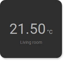
<cv-info format="%.2f">
    <cv-address slot="address" mode="read" transform="DPT:9.001">1/4/2</cv-address>
    <span slot="label">Living room</span>
    <span slot="unit">°C</span>
</cv-info>
It is necessary to specify a <cv-address slot="address"> through which the value to be displayed is transmitted.
In addition, a unit for the value can be specified with <span slot="unit"> and a label
via <span slot="label">. The value can be formatted using the format attribute.
It is also possible to specify the unit via the formatting, then it is displayed next to the value and not below it.
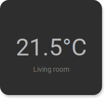
<cv-info format="%.1f°C">
    <cv-address slot="address" mode="read" transform="DPT:9.001">1/4/2</cv-address>
    <span slot="label">Living room</span>
</cv-info>
It is of course also possible to use one of the other display formats of the Value. For displaying numbers, a progress bar is a good choice, for example.
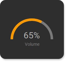
<cv-info format="%d%%">
    <cv-address slot="address" mode="read" transform="DPT:5.001">1/4/2</cv-address>
    <cv-round-progress slot="value-component" type="semiCircle"/>
    <span slot="label">Volume</span>
</cv-info>
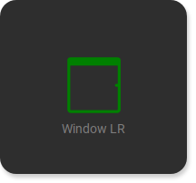
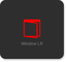
Or an Icon to show a window status.
Window closed |
Window opened |
...
<cv-meta>
    <cv-mapping name="WindowOpen">
        <entry value="0">knxuf-fts_window_1w</entry>
        <entry value="1">knxuf-fts_window_1w_open</entry>
    </cv-mapping>
    <cv-styling name="WindowOpen">
        <entry value="0">green</entry>
        <entry value="1">red</entry>
    </cv-styling>
</cv-meta>
...
<cv-info mapping="WindowOpen" styling="WindowOpen">
    <cv-address slot="address" mode="read" transform="DPT:1.001">1/4/2</cv-address>
    <cv-icon slot="value-component" size="xxx-large"/>
    <span slot="label">Window LR</span>
</cv-info>
Allowed attributes in the Info element
Element |
Attribute |
|||
|---|---|---|---|---|
Name |
Content |
Description |
||
cv-info |
styling |
string |
Change the color of the displayed value depending on its value. See also styling |
|
mapping |
string |
Map the bus value to a different value, text or symbol for displaying. See also mapping |
||
format |
string |
Formatting of the value (printf syntax). |
||
size |
button, 0.5x0.5, 1x0.5, 1x1, 2x1, 2x1.5, 1x2, 2x2, 2x4 or 4x2 |
Size of the tile in {columns}x{rows}, 1x1 is the default size. |
||
value-size |
medium, normal or large |
Defines the font size of the value. |
||
visible-on |
mobile or desktop |
Controls this element’s visibility by screen size. |
||
class |
string |
Add this value to the CSS class so that it can be formatted by a user provided style sheet. |
||
style |
string |
Custom CSS style rules for this widget. |
||
Allowed child elements and their attributes
Element |
Attribute |
|||
|---|---|---|---|---|
Structure |
Name |
Content |
Description |
|
|
slot |
address or tileAddress |
||
transform |
string |
Defines the datatype in the backend, e.g. DPT:1.001 for KNX datapoint type 1.001. |
||
mode |
disable, read, write or readwrite |
Defines if this address is only used to |
||
value |
string |
Fixed value sent to this address. |
||
on |
click, down or up |
Event on which a |
||
target |
string |
Target in the parent widget the value if this address should be use for. The possible values depend on the parent widget. |
||
format-pos |
decimal |
Position for format string when multiple addresses are used. |
||
qos |
decimal |
Only MQTT: QoS |
||
retain |
true or false |
Only MQTT: retain flag |
||
selector |
string |
Only MQTT: JSON selector |
||
backend |
string |
Optional name of the backend this address belongs to. |
||
mapping |
string |
Map the bus value to a different value, text or symbol for displaying. See also mapping |
||
format |
string |
Formatting of the value (printf syntax). |
||
delay |
positiveInteger |
Optional delay in milliseconds that a write-request to this address is delayed. |
||
send-mode |
on-change or always |
Usually the elements that are using this address receive an update-event only when that value hast changed ( |
||
Element |
Attribute |
|||
|---|---|---|---|---|
Structure |
Name |
Content |
Description |
|
|
operator |
+, -, * or / |
Math operator used for calculation. |
|
round |
true or false |
Round the result. |
||
factor |
float |
Multiply the result with this value. |
||
|
transform |
string |
Transformation of the bus system value to be shown. |
|
mode |
disable, read, write or readwrite |
“disable” deactivates the communication, “read” will only fetch data from the backend, “write” will only write to it and an address with “readwrite” will be both, read from and written to. |
||
variant |
string |
|||
format-pos |
decimal |
Position for format string when multiple addresses are used. |
||
selector |
string |
Only MQTT: JSON selector |
||
qos |
decimal |
Only MQTT: QoS |
||
retain |
true or false |
Only MQTT: retain flag |
||
ignore-error |
true or false |
Only MQTT: ignore decode errors. |
||
|
string |
The GA (like: 12/0/7) for KNX-backends, the item name for openHAB-backend or the MQTT topic |
||
Element |
Attribute |
|||
|---|---|---|---|---|
Structure |
Name |
Content |
Description |
|
|
radius |
integer |
Radius of the circle. |
|
stroke |
integer |
Stroke width of the circle border. |
||
type |
circle or semiCircle |
Visualization type. |
||
min |
decimal |
Minimum value. |
||
max |
decimal |
Maximum value. |
||
foreground-color |
string |
Color of the value bar. |
||
background-color |
string |
Color of the background bar. |
||
visible-on |
mobile or desktop |
Controls this element’s visibility by screen size. |
||
class |
string |
Add this value to the CSS class so that it can be formatted by a user provided style sheet. |
||
style |
string |
Custom CSS style rules for this widget. |
||
Element |
Attribute |
|||
|---|---|---|---|---|
Structure |
Name |
Content |
Description |
|
|
size |
small, large, x-large, xx-large or xxx-large |
Defines the size of the icon. |
|
color |
string |
Icon color. |
||
visible-on |
mobile or desktop |
Controls this element’s visibility by screen size. |
||
class |
string |
Add this value to the CSS class so that it can be formatted by a user provided style sheet. |
||
style |
string |
Custom CSS style rules for this widget. |
||
|
string |
|||
Element |
Attribute |
|||
|---|---|---|---|---|
Structure |
Name |
Content |
Description |
|
|
min |
integer |
||
max |
integer |
|||
value |
integer |
|||
visible-on |
mobile or desktop |
Controls this element’s visibility by screen size. |
||
class |
string |
Add this value to the CSS class so that it can be formatted by a user provided style sheet. |
||
style |
string |
Custom CSS style rules for this widget. |
||
Element |
Attribute |
|||
|---|---|---|---|---|
Structure |
Name |
Content |
Description |
|
|
slot |
label, unit or title |
||
tr |
true or false |
Defines that the text content of this element should be translated. |
||
Element |
Attribute |
|||
|---|---|---|---|---|
Structure |
Name |
Content |
Description |
|
|
title |
string |
Title of the chart. |
|
y-format |
string |
Format the value on the y-axis. (printf syntax) |
||
x-format |
string |
Format of the date on the x-axis. (see: https://d3js.org/d3-time-format#locale_format). If this value is not provided its automatically determined based on the currently shown ‘series’. Defining an explicit formatting overrides this. |
||
series |
hour, day, week, month or year |
Time span of the data. |
||
selection |
string |
Type of the chart element. |
||
allow-fullscreen |
true or false |
Allows showing the chart in fullscreen size. |
||
show-x-axis |
true or false |
Show x-axis scale (default = true). |
||
show-y-axis |
true or false |
Show y-axis scale (default = true). |
||
refresh |
decimal |
Time interval in seconds this widget is being refreshed. |
||
show-grid |
xy, x, y or false |
Show grid lines. |
||
background |
true or false |
Show the chart in the background of a tile. |
||
min |
decimal |
Minimum value. |
||
max |
decimal |
Maximum value. |
||
visible-on |
mobile or desktop |
Controls this element’s visibility by screen size. |
||
class |
string |
Add this value to the CSS class so that it can be formatted by a user provided style sheet. |
||
style |
string |
Custom CSS style rules for this widget. |
||
row |
1, 2, 3, first, middle or last |
Row number or position (first, middle, last) |
||
column |
1, 2, 3, first, middle or last |
Column number or position (first, middle, last) |
||
rowspan |
integer |
Number of rows this element spans |
||
colspan |
integer |
Number of columns this element spans |
||
Element |
Attribute |
|||
|---|---|---|---|---|
Structure |
Name |
Content |
Description |
|
|
modal |
true or false |
Disables the background while the popup is open. |
|
fullscreen |
true or false |
Open the popup in fullscreen mode. |
||
title |
string |
Headline of this popup. |
||
auto-close-timeout |
integer |
Time in seconds when the popup is automatically closed. |
||
visible-on |
mobile or desktop |
Controls this element’s visibility by screen size. |
||
class |
string |
Add this value to the CSS class so that it can be formatted by a user provided style sheet. |
||
style |
string |
Custom CSS style rules for this widget. |
||
|
string |
|||
|
transform |
string |
Transformation of the bus system value to be shown. |
|
mode |
disable, read, write or readwrite |
“disable” deactivates the communication, “read” will only fetch data from the backend, “write” will only write to it and an address with “readwrite” will be both, read from and written to. |
||
variant |
string |
|||
format-pos |
decimal |
Position for format string when multiple addresses are used. |
||
selector |
string |
Only MQTT: JSON selector |
||
qos |
decimal |
Only MQTT: QoS |
||
retain |
true or false |
Only MQTT: retain flag |
||
ignore-error |
true or false |
Only MQTT: ignore decode errors. |
||
|
string |
The GA (like: 12/0/7) for KNX-backends, the item name for openHAB-backend or the MQTT topic |
||
