Caution
This is the documentation for the current development branch of the CometVisu. It is possible that some of the described features are not yet available in the current release.
Also there might be lots of errors in this documentation as some parts of the content have been translated by an online translation service.
List
Description
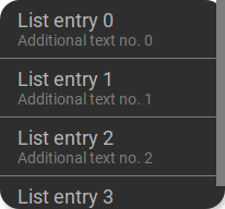
The List component allows you to create lists of similar elements. The list requires a data model that contains an entry with data for each element in the list and a template that defines the HTML code for the respective list elements. The List component now creates an HTML element based on the template and fills it with the data from an entry in the data model.
<cv-widget>
    <cv-tile>
        <cv-list rowspan="3" colspan="3">
            <model>
                <script><![CDATA[
                    for (let i = 0; i < 4; i++) {
                        model.push({
                            label: 'List entry ' + i,
                            subLabel: 'Additional text no. ' + i
                        })
                    }]]>
                </script>
            </model>
            <template>
                <li>
                    <label class="primary">${label}</label>
                    <label class="secondary">${subLabel}</label>
                </li>
            </template>
        </cv-list>
    </cv-tile>
</cv-widget>
The data model in this case is generated from simple JavaScript code and has the following content.
[
     {
         "label": "This is list item no 0",
         "subLabel": "Sublabel number 0"
     },
     {
         "label": "This is list item no 1",
         "subLabel": "Sublabel number 1"
     },
     {
         "label": "This is list item no 2",
         "subLabel": "Sublabel number 2"
     },
     {
         "label": "This is list item no 3",
         "subLabel": "Sublabel number 3"
     },
     {
         "label": "This is list item no 4",
         "subLabel": "Sublabel number 4"
     }
]
For each entry in this array, an HTML element is now created from the template and filled with the data from the model entry. For the first entry from the model, the following HTML code is generated.
<li>
    <label class="primary">This is list item no 0</label>
    <label class="secondary">Sublabel number 0</label>
</li>
Formatting a date
If a date value is present in the model, it can be formatted accordingly.
Assuming the date value is present in the model under the name published, it can then be output formatted as follows
be used <div>${published|dd.MM.yyyy HH:mm}</div>. The date format is separated from the variable name by a |.
A list of possible format entries can be found here: DateFormat
Sending data on selection
If <cv-listitem> elements are used as list elements, it is possible to send a value to the backend when one is clicked.
If the model contains a value attribute, this value can be sent to a backend address.
<cv-widget>
    <cv-tile>
        <cv-list rowspan="3" colspan="3">
            <cv-address transform="DPT:5.010" mode="write">1/4/1</cv-address>
            <model>
                <script><![CDATA[
                    for (let i = 0; i < 4; i++) {
                        model.push({
                            label: 'List entry ' + i,
                            value: i
                        })
                    }]]>
                </script>
            </model>
            <template>
                <cv-listitem onclick="fireEvent('sendState', ${value})">
                    <div class="content">
                      <label class="primary">${label}</label>
                    </div>
                </cv-listitem>
            </template>
        </cv-list>
    </cv-tile>
</cv-widget>
Data model
The data model is a JavaScript array and can be filled either by JavaScript code or by data from the backend. A simple example of a script-based model has already been given above. Of course, it is also possible to use more complex code and load the model from external sources.
JavaScript code as source
The model can be filled with any JavaScript code. The following example shows how the model can be filled with a loop.
Fixed model
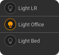
The model can also be defined via individual cv-data elements. These elements allow any attributes that are
transferred to the model. Within the templates, of course, any components can be used. Here a cv-listitem is used,
which displays an operable :ref:Button <tile-component-button>` next to a text.
...
<cv-meta>
    <cv-mapping name="light">
        <entry value="0">ri-lightbulb-line</entry>
        <entry value="1">ri-lightbulb-fill</entry>
    </cv-mapping>
</cv-meta>
...
<cv-widget>
    <cv-tile>
        <cv-list rowspan="3" colspan="3">
            <model>
                <cv-data label="Light LR" control-address="1/4/0"/>
                <cv-data label="Light Office" control-address="1/4/1"/>
                <cv-data label="Light Bed" control-address="1/4/2"/>
            </model>
            <template>
                <cv-listitem>
                    <cv-button class="round-button" mapping="light" size="small">
                        <cv-address mode="readwrite" transform="DPT:1.001">${control-address}</cv-address>
                        <cv-icon class="value"/>
                    </cv-button>
                    <div class="content">
                        <label class="primary">${label}</label>
                    </div>
                </cv-listitem>
            </template>
        </cv-list>
    </cv-tile>
</cv-widget>
The model generated from this has the following content:
[
    {
        "index": 0,
        "label": "Light LR",
        "control-address": "1/4/0"
    },
    {
        "index": 1,
        "label": "Light office",
        "control-address": "1/4/1"
    },
    {
        "index": 2,
        "label": "Light bed",
        "control-address": "1/4/2"
    }
]
Backend as source
Using the backend as a source currently only works with the openHAB backend and the GroupItems available there.
The members of these GroupItems are known to the CometVisu and can be used as a source for a list model using the address members:<group-name>.
Only the raw transform may be used here.
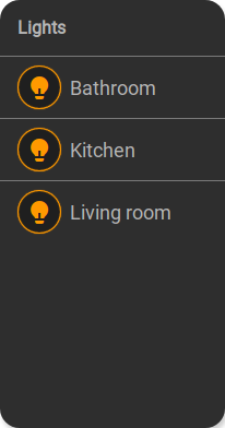
These types of models allow you to display only the active members (e.g. only lights that are switched on) by using the filter item.active===true.
Sorting is also possible.
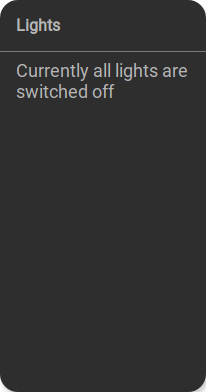
Filtering can lead to an empty model. In this case, an alternative template can be defined (<template when="empty">), which is then displayed.
Model with entries |
Empty model |
...
<cv-meta>
    <cv-mapping name="light">
        <entry value="0">ri-lightbulb-line</entry>
        <entry value="1">ri-lightbulb-fill</entry>
    </cv-mapping>
</cv-meta>
...
<cv-widget size="1x2">
    <cv-tile>
       <cv-list rowspan="3" colspan="3">
            <model filter="item.active===true" sort-by="label">
                <cv-address transform="raw" mode="read">members:Lights</cv-address>
            </model>
            <header>
                <h4>Lights</h4>
            </header>
            <template>
                <cv-listitem>
                    <cv-button class="round-button" mapping="light" size="small">
                        <cv-address mode="readwrite" transform="OH:switch">${name}</cv-address>
                        <cv-icon class="value"/>
                    </cv-button>
                    <div class="content">
                        <label class="primary">${label}</label>
                    </div>
                </cv-listitem>
            </template>
            <template when="empty">
                <li><label class="primary">Currently all lights are switched off</label></li>
            </template>
       </cv-list>
    </cv-tile>
</cv-widget>
The model for the members of a GroupItem has the following structure:
[
{
    "type": "switch",
    "state": "OFF",
    "label": "Light living room",
    "name": "Light_FF_Living",
    "active": true
},
{
    "type": "switch",
    "state": "OFF",
    "label": "Light bathroom",
    "name": "Light_FF_Toilet",
    "active": true
},
{
    "type": "switch",
    "state": "OFF",
    "label": "Light kitchen",
    "name": "Light_FF_Kitchen",
    "active": true
}]
Builtin models
The CometVisu provides some predefined models that can be used to include some data sources from plugins. So far it is possible to query the call list of a Fritz!Box via the tr064 plugin and the data from the RSSlog database. For this it is not necessary to include the plugins in the config, because only the data is queried and otherwise nothing is used from the plugins themselves. Necessary configurations, such as storing access data in the hidden Configuration, such as for the tr064 plugin must of course also be made here so that the Data query for list models works.
Hint
For the two models presented here, it is absolutely necessary that the CometVisu is delivered by a web server with PHP support. This requirement is met in the official Docker container of the CometVisu. If the CometVisu is delivered by the openHAB web server, this is not the case and the list models cannot be used.
Example to display the call list from the tr064 plugin:
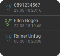
<cv-widget>
    <cv-tile>
        <cv-list rowspan="3" colspan="3" refresh="120">
            <model class="FritzCallList" parameters="device=tr064device,max=10"/>
            <template>
              <li>
                <div style="float: left; font-size: 1.5em; padding-right: 8px">
                  <i class="knxuf-phone_call_in" style="color: #268DDA; vertical-align: middle;" when="${Type}=1"/>
                  <i class="knxuf-phone_missed_in" style="color: #E45F3B; vertical-align: middle;" when="${Type}=2"/>
                  <i class="knxuf-phone_call_out" style="color: #8BBF68; vertical-align: middle;" when="${Type}=3"/>
                </div>
                <div style="overflow: hidden; text-overflow: ellipsis; white-space: nowrap;">
                  ${Name || Caller}
                  <div style="font-size: 0.9em; color: #777;">${Date}</div>
                </div>
              </li>
            </template>
        </cv-list>
    </cv-tile>
</cv-widget>
Example to display the entries from the RssLog plugin:
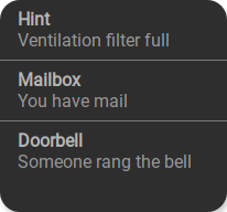
<cv-widget>
    <cv-tile>
        <cv-list rowspan="3" colspan="3" refresh="120">
            <model class="RssLog" parameters="limit=10"/>
            <template>
              <li style="overflow: hidden; text-overflow: ellipsis; white-space: nowrap;">
                <div style="font-weight: bold">${title}</div>
                <div style="color: #999">${content}</div>
              </li>
            </template>
        </cv-list>
    </cv-tile>
</cv-widget>
Note
The value publishedDate is available as a Javascript Date object under the name published. This makes it possible
to output the date in the desired format: Formatting a date
This model supports some additional features of the RssLog plugin: Mapping and confirming or deleting an entry.
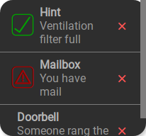
...
<cv-meta>
    <cv-mapping name="StateConfirm">
        <entry value="0"><cv-icon color="#A00000">knxuf-info_warning</cv-icon></entry>
        <entry value="1"><cv-icon color="#00A000">knxuf-info_ack</cv-icon></entry>
    </cv-mapping>
</cv-meta>
...
<cv-widget>
    <cv-tile>
        <cv-list rowspan="3" colspan="3" refresh="120">
            <model class="RssLog" parameters="limit=10"/>
            <template>
                <li style="display: flex; align-items: center; gap: 8px;">
                    <div data-action="toggle-state">${mappedState}</div>
                    <div style="flex: 1">
                        <div style="font-weight: bold">${title}</div>
                        <div style="color: #999; display: flex; align-items: center;">${content}</div>
                    </div>
                    <cv-icon data-action="delete" size="small" color="rgb(255 86 86)">ri-close-line</cv-icon>
                </li>
            </template>
        </cv-list>
    </cv-tile>
</cv-widget>
To be able to confirm or delete an entry, the element that should trigger this action when clicked must be provided with the attribute data-action.
The values of this attribute determine the action to be triggered. Currently the following values are possible: toggle-state (confirm) and delete (delete).
The deletion of an entry must always be confirmed by the user in a popup. The confirmation dialog can be deactivated by the attribute data-no-confirm="true".
If the entry was created with a mapping, it can be used with ${mappedState} in the template.
openHAB persistence service
It is possible to use the history of an openHAB item as a list model. A simple example of this
shows the history of the item MyItem:
<cv-widget>
    <cv-tile>
        <cv-list rowspan="3" colspan="3" refresh="120">
            <model class="OpenHAB" parameters="item=MyItem"/>
            <template>
              <li style="overflow: hidden; text-overflow: ellipsis; white-space: nowrap;">
                <div style="color: #999">${content}</div>
              </li>
            </template>
        </cv-list>
    </cv-tile>
</cv-widget>
Allowed attributes
Element |
Attribute |
|||
|---|---|---|---|---|
Name |
Content |
Description |
||
cv-list |
refresh |
decimal |
Time interval in seconds this widget is being refreshed. |
|
rowspan |
integer |
Number of rows this element spans |
||
colspan |
integer |
Number of columns this element spans |
||
allow-fullscreen |
true or false |
Allows showing the list in fullscreen size. |
||
visible-on |
mobile or desktop |
Controls this element’s visibility by screen size. |
||
class |
string |
Add this value to the CSS class so that it can be formatted by a user provided style sheet. |
||
style |
string |
Custom CSS style rules for this widget. |
||
Allowed child elements and their attributes
Element |
Attribute |
|||
|---|---|---|---|---|
Structure |
Name |
Content |
Description |
|
|
target |
parent |
Defines the target, where new list elements are added. Usually an extra <ul> element is created for that. |
|
Element |
Attribute |
|||
|---|---|---|---|---|
Structure |
Name |
Content |
Description |
|
|
src |
anyURI |
URL from where the model should be loaded (must return JSON). |
|
limit |
positiveInteger |
Limits the model entries |
||
sort-by |
string |
|||
sort-mode |
asc or desc |
|||
filter |
string |
|||
class |
FritzCallList, RssLog or OpenHAB |
Special builtin list models that are included in the CometVisu. |
||
parameters |
string |
Parameter for the class list models. |
||
Element |
Attribute |
|||
|---|---|---|---|---|
Structure |
Name |
Content |
Description |
|
|
transform |
string |
Defines the datatype in the backend, e.g. DPT:1.001 for KNX datapoint type 1.001. |
|
mode |
disable, read, write or readwrite |
Defines if this address is only used to |
||
value |
string |
Fixed value sent to this address. |
||
on |
click, down or up |
Event on which a |
||
target |
string |
Target in the parent widget the value if this address should be use for. The possible values depend on the parent widget. |
||
format-pos |
decimal |
Position for format string when multiple addresses are used. |
||
qos |
decimal |
Only MQTT: QoS |
||
retain |
true or false |
Only MQTT: retain flag |
||
selector |
string |
Only MQTT: JSON selector |
||
backend |
string |
Optional name of the backend this address belongs to. |
||
mapping |
string |
Map the bus value to a different value, text or symbol for displaying. See also mapping |
||
format |
string |
Formatting of the value (printf syntax). |
||
delay |
positiveInteger |
Optional delay in milliseconds that a write-request to this address is delayed. |
||
send-mode |
on-change or always |
Usually the elements that are using this address receive an update-event only when that value hast changed ( |
||
|
string |
The GA (like: 12/0/7) for KNX-backends, the item name for openHAB-backend or the MQTT topic |
||