Caution
This is the documentation for the current development branch of the CometVisu. It is possible that some of the described features are not yet available in the current release.
Also there might be lots of errors in this documentation as some parts of the content have been translated by an online translation service.
Group
The group component can be used to group widgets. Groups always have a visible title that spans the entire available width and below that the widgets. Groups can be open (widgets are visible) or closed (widgets are not visible). By clicking on the title, the state can be toggled between these states.

closed group

opened group
...
<cv-meta>
    <cv-mapping name="light">
        <entry value="0">ri-lightbulb-line</entry>
        <entry value="1">ri-lightbulb-fill</entry>
    </cv-mapping>
    <cv-styling name="button">
        <entry value="1">active</entry>
        <entry value="0">inactive</entry>
    </cv-styling>
</cv-meta>
...
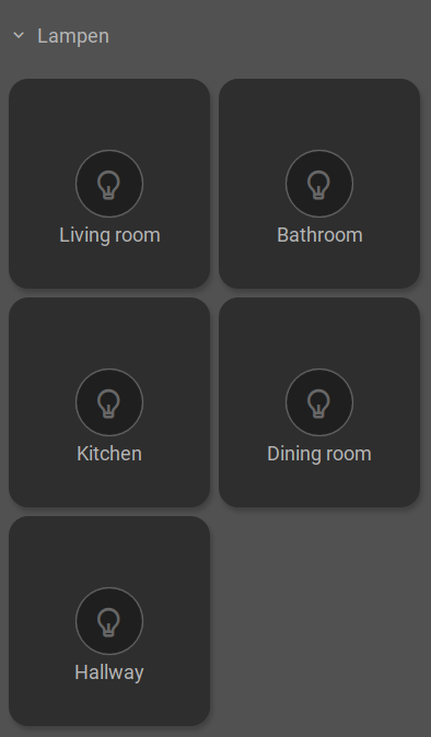
<cv-group name="Lampen">
    <cv-switch mapping="light" styling="button">
        <cv-address slot="address" transform="DPT:1.001">1/4/0</cv-address>
        <span slot="primaryLabel">Living room</span>
    </cv-switch>
    <cv-switch mapping="light" styling="button">
       <cv-address slot="address" transform="DPT:1.001">1/4/1</cv-address>
        <span slot="primaryLabel">Bathroom</span>
    </cv-switch>
    <cv-switch mapping="light" styling="button">
        <cv-address slot="address" transform="DPT:1.001">1/4/2</cv-address>
        <span slot="primaryLabel">Kitchen</span>
    </cv-switch>
    <cv-switch mapping="light" styling="button">
        <cv-address slot="address" transform="DPT:1.001">1/4/3</cv-address>
        <span slot="primaryLabel">Dining room</span>
    </cv-switch>
    <cv-switch mapping="light" styling="button">
        <cv-address slot="address" transform="DPT:1.001">1/4/4</cv-address>
        <span slot="primaryLabel">Hallway</span>
    </cv-switch>
</cv-group>
In the summary element, further components can be placed. For example, if you have a group representing a room, you can use it to display the room temperature, the window status, and a light switch.

...
<cv-meta>
    <cv-mapping name="OpenClose">
        <entry value="1">knxuf-fts_window_1w_open</entry>
        <entry value="0">knxuf-fts_window_1w</entry>
    </cv-mapping>
    <cv-styling name="WindowOpen">
        <entry range-min="1">red</entry>
    </cv-styling>
</cv-meta>
...
<cv-group name="Living room">
    <summary>
        <cv-value mapping="OpenClose" styling="WindowOpen">
            <cv-address mode="read" transform="DPT:1.001">1/4/1</cv-address>
            <cv-icon class="value" size="large"/>
        </cv-value>
        <cv-button class="round-button" mapping="tile-light" styling="tile-button" size="small">
            <cv-address transform="DPT:1.001">1/4/2</cv-address>
            <cv-icon class="value ri-question-mark"/>
        </cv-button>
        <cv-value format="%.1f °C">
            <cv-address mode="read" transform="DPT:9.001">1/4/0</cv-address>
            <label class="value"/>
        </cv-value>
    </summary>
</cv-group>
Hint
The mapping (tile-light) & styling (tile-button) used in the light switch are provided by the tile structure
and used in the switch widget, for example. Therefore, they do not need to be defined separately in the configuration
Allowed attributes
Element |
Attribute |
|||
|---|---|---|---|---|
Name |
Content |
Description |
||
cv-group |
icon |
string |
Icon for the group. |
|
name |
string |
Name of the group. |
||
open |
true or false |
Makes the groups content visible, otherwise only the content of “summary” is visible. |
||
wrap |
true or false |
Prevents line wraps when the content is wider that the screen size. The content will be horizontally scrollable instead. |
||
hide-on-scroll |
true or false |
Fades out this content, if the page content has been scrolled. |
||
visible-on |
mobile or desktop |
Controls this element’s visibility by screen size. |
||
class |
string |
Add this value to the CSS class so that it can be formatted by a user provided style sheet. |
||
style |
string |
Custom CSS style rules for this widget. |
||