Caution
This is the documentation for the current development branch of the CometVisu. It is possible that some of the described features are not yet available in the current release.
Also there might be lots of errors in this documentation as some parts of the content have been translated by an online translation service.
The clock plugin
Description
This plugins integrates a clock into the visualization
Settings
For a general understanding of how the configuration files are structured and what elements and attributes are it is recommended to read this section first: Basics.
The behaviour and appearance of the clock plugins can be influenced by using certain attributes and elements. The following tables show the allowed attributes and elements and their possible values. The screenshots show, how both can be edited in the editor.
Attributes underlined by ….. are mandatory, all the others are optional and be omitted.
Allowed attributes in the gauge-element
Element |
Attribute |
|||
|---|---|---|---|---|
Name |
Content |
Description |
||
clock |
src |
string |
URL of the clock face SVG file |
|
src_popup |
string |
URL of the clock face SVG file used for pop up window |
||
title_popup |
string |
Title shown in the pop up |
||
hide_24h |
true or false |
Hide the 24h hand. |
||
hide_24h_popup |
true or false |
Hide the 24h hand in the pop up. |
||
hide_am_pm |
true or false |
Hide display of AM/PM. |
||
hide_am_pm_popup |
true or false |
Hide display of AM/PM in the pop up. |
||
hide_digits |
true or false |
Hide numerical display of the time. |
||
hide_digits_popup |
true or false |
Hide numerical display of the time in the pop up. |
||
hide_seconds |
true or false |
Set only hours and minutes and hide the second hand. |
||
hide_seconds_popup |
true or false |
Set only hours and minutes and hide the second hand in the pop up. |
||
send_on_finish |
true or false |
Send only when the slider is released. |
||

Allowed child-elements and their attributes
Element |
Attribute |
|||
|---|---|---|---|---|
Structure |
Name |
Content |
Description |
|
|
colspan |
decimal |
Amount of columns this widget should be wide. |
|
colspan-m |
decimal |
Overrules the amount of columns on a medium screen. |
||
colspan-s |
decimal |
Overrules the amount of columns on a small screen. |
||
rowspan |
decimal |
Amount of rows this widget should be high. |
||
x |
string |
Horizontal position of the widget for 2D pages. |
||
x-s |
string |
Horizontal position of the widget for 2D pages on a small screen. |
||
x-m |
string |
Horizontal position of the widget for 2D pages on a medium screen. |
||
y |
string |
Vertical position of the widget for 2D pages. |
||
y-s |
string |
Vertical position of the widget for 2D pages on a small screen. |
||
y-m |
string |
Vertical position of the widget for 2D pages on a medium screen. |
||
z |
string |
Reserved for future use. |
||
width |
string |
Width for the widget for 2D pages. |
||
width-s |
string |
Width for the widget for 2D pages on a small screen. |
||
width-m |
string |
Width for the widget for 2D pages on a medium screen. |
||
scale |
true or false |
Enable/Disable scaling layout values relative to backdrop on 2d pages (default: true). |
||
scale-s |
true or false |
Enable/Disable scaling layout values relative to backdrop on 2d pages on a small screen (default: true). |
||
scale-m |
true or false |
Enable/Disable scaling layout values relative to backdrop on 2d pages on a medium screen (default: true). |
||
Element |
Attribute |
|||
|---|---|---|---|---|
Structure |
Name |
Content |
Description |
|
|
name |
string |
Name of the icon registration. |
|
type |
string |
|||
flavour |
string |
Selection of a display variant. See also Flavour. |
||
color |
string |
Color of the icon in CSS notation (e.g. #1188FF). |
||
styling |
string |
Change the color of the displayed value depending on its value. See also Styling |
||
class |
string |
Add this value to the CSS class so that it can be formatted by a user provided style sheet. |
||
|
string |
Text to display a label for the widget. |
||
Element |
Attribute |
|||
|---|---|---|---|---|
Structure |
Name |
Content |
Description |
|
|
transform |
string |
Transformation of the bus system value to be shown. |
|
mode |
disable, read, write or readwrite |
“disable” deactivates the communication, “read” will only fetch data from the backend, “write” will only write to it and an address with “readwrite” will be both, read from and written to. |
||
variant |
string |
|||
format-pos |
decimal |
Position for format string when multiple addresses are used. |
||
selector |
string |
Only MQTT: JSON selector |
||
qos |
decimal |
Only MQTT: QoS |
||
retain |
true or false |
Only MQTT: retain flag |
||
ignore-error |
true or false |
Only MQTT: ignore decode errors. |
||
|
string |
The GA (like: 12/0/7) for KNX-backends, the item name for openHAB-backend or the MQTT topic |
||

Elements in the editor
Examples
It is possible to manually edit the visu_config.xml and add an entry for the gauge plugin.
Caution
Make sure that you only use UTF-8 encoded characters by settings the encoding in your XML-editor to UTF-8 mode!
This example clock plugin is created by the following code:

Clock plugin
...
<meta>
    <plugins>
        <plugin name="clock"/>
    </plugins>
</meta>
...
<clock src="plugins/clock/clock_pure.svg">
    <layout colspan="2" rowspan="2"/>
    <address transform="DPT:10.001" mode="readwrite">12/7/10</address>
</clock>
Custom clock face
The attribute src allows the use of a custom clock face. It must be
supplied as a SVG file and follow the described standard defined below:
The hands and their elements must be contained in a SVG group each and have the corresponding ID:
Hour24- the 24h handHour- the hour handMinute- the minute handSecond- the second handAM- the “AM” display for the morningPM- the “PM” display for afternoonDigits- the numerical display of the timeHour24Group- the clock face of the 24h hand
The hands will be positioned by a rotation around the origin. So it is usually required that the hands are within an additional SVG group that moves them to the desired position.
When the config file hides elements the corresponding layer is hidden by a
display="none".For a quick start the clock face “full” can be used and modified by an SVG editor like Inkscape.
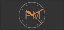
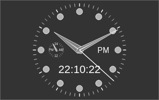
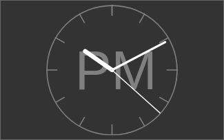
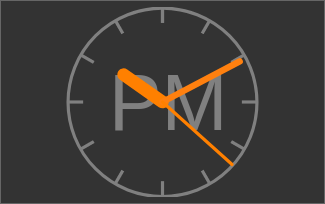
The CometVisu comes with these clock faces:

Clock face “full”: plugins/clock/clock_full.svg

Clock face “simple”: plugins/clock/clock_simple.svg

Clock face “pure”: plugins/clock/clock_pure.svg
Footnotes