Caution
This is the documentation for the current development branch of the CometVisu. It is possible that some of the described features are not yet available in the current release.
Also there might be lots of errors in this documentation as some parts of the content have been translated by an online translation service.
The Refresh widget
Description
With the widget refresh, the visu is added a switch, which allows the visu to reload the displayed data.
Settings
For a general understanding of how the configuration files are structured and what elements and attributes are it is recommended to read this section first: Basics.
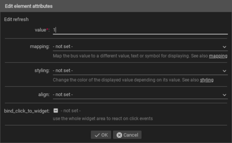
The behaviour and appearance of the Refresh widget can be influenced by using certain attributes and elements. The following tables show the allowed attributes and elements and their possible values. The screenshots show, how both can be edited in the editor.
Attributes underlined by ….. are mandatory, all the others are optional and be omitted.
Allowed attributes in the Refresh-element
Element |
Attribute |
|||
|---|---|---|---|---|
Name |
Content |
Description |
||
refresh |
value |
string |
||
mapping |
string |
Map the bus value to a different value, text or symbol for displaying. See also Mapping |
||
styling |
string |
Change the color of the displayed value depending on its value. See also Styling |
||
align |
left, right or center |
|||
flavour |
string |
Selection of a display variant. See also Flavour. |
||
bind_click_to_widget |
true or false |
use the whole widget area to react on click events |
||
class |
string |
Add this value to the CSS class so that it can be formatted by a user provided style sheet. |
||

Allowed child-elements and their attributes
Element |
Attribute |
|||
|---|---|---|---|---|
Structure |
Name |
Content |
Description |
|
|
colspan |
decimal |
Amount of columns this widget should be wide. |
|
colspan-m |
decimal |
Overrules the amount of columns on a medium screen. |
||
colspan-s |
decimal |
Overrules the amount of columns on a small screen. |
||
rowspan |
decimal |
Amount of rows this widget should be high. |
||
x |
string |
Horizontal position of the widget for 2D pages. |
||
x-s |
string |
Horizontal position of the widget for 2D pages on a small screen. |
||
x-m |
string |
Horizontal position of the widget for 2D pages on a medium screen. |
||
y |
string |
Vertical position of the widget for 2D pages. |
||
y-s |
string |
Vertical position of the widget for 2D pages on a small screen. |
||
y-m |
string |
Vertical position of the widget for 2D pages on a medium screen. |
||
z |
string |
Reserved for future use. |
||
width |
string |
Width for the widget for 2D pages. |
||
width-s |
string |
Width for the widget for 2D pages on a small screen. |
||
width-m |
string |
Width for the widget for 2D pages on a medium screen. |
||
scale |
true or false |
Enable/Disable scaling layout values relative to backdrop on 2d pages (default: true). |
||
scale-s |
true or false |
Enable/Disable scaling layout values relative to backdrop on 2d pages on a small screen (default: true). |
||
scale-m |
true or false |
Enable/Disable scaling layout values relative to backdrop on 2d pages on a medium screen (default: true). |
||
Element |
Attribute |
|||
|---|---|---|---|---|
Structure |
Name |
Content |
Description |
|
|
name |
string |
Name of the icon registration. |
|
type |
string |
|||
flavour |
string |
Selection of a display variant. See also Flavour. |
||
color |
string |
Color of the icon in CSS notation (e.g. #1188FF). |
||
styling |
string |
Change the color of the displayed value depending on its value. See also Styling |
||
class |
string |
Add this value to the CSS class so that it can be formatted by a user provided style sheet. |
||
|
string |
Text to display a label for the widget. |
||

Elements in the editor
Examples
It is possible to manually edit the visu_config.xml and add an entry for the Refresh widget.
Caution
Make sure that you only use UTF-8 encoded characters by settings the encoding in your XML-editor to UTF-8 mode!
Footnotes