Caution
This is the documentation for the current development branch of the CometVisu. It is possible that some of the described features are not yet available in the current release.
Also there might be lots of errors in this documentation as some parts of the content have been translated by an online translation service.
Select
Description
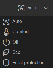
The Select component allows you to select a value from a predefined list. A possible use case is, for example, selecting the operating mode of a room temperature controller. The currently selected value is displayed and when you click on the component, the list opens with possible values from which one can be selected.
With the show attribute you can specify whether only the icon (show="icon"), only
the text (show="label") or both (show="both") of the currently selected value is displayed. If the attribute is not specified,
both are displayed.

Normal view

with opened selection list
<cv-select>
    <cv-address transform="DPT:20.102">1/4/2</cv-address>
    <cv-option key="auto">
        <cv-icon>ri-character-recognition-line</cv-icon>Auto
    </cv-option>
    <cv-option key="comfort">
        <cv-icon>ri-temp-cold-line</cv-icon>Comfort
    </cv-option>
    <cv-option key="standby">
        <cv-icon>ri-shut-down-line</cv-icon>Off
    </cv-option>
    <cv-option key="economy">
        <cv-icon>ri-leaf-line</cv-icon>Eco
    </cv-option>
    <cv-option key="building_protection">
        <cv-icon>ri-shield-line</cv-icon>Frost protection
    </cv-option>
</cv-select>
To be able to display the current value, a read-only cv-address is required, to be able to change the value a writable one is needed.
In the example, the address is both (default).
The entries in the selection list are defined by cv-option elements.
These have a key which corresponds to the value that is read from or sent to the address and
a content, which in the example consists of a combination of an Icon and text.
Allowed attributes
Element |
Attribute |
|||
|---|---|---|---|---|
Name |
Content |
Description |
||
cv-select |
styling |
string |
Change the color of the displayed value depending on its value. See also styling |
|
mapping |
string |
Map the bus value to a different value, text or symbol for displaying. See also mapping |
||
format |
string |
Formatting of the value (printf syntax). |
||
show |
both, icon or label |
Defines which content of the selection option should be shown (“both”: icon and label, “icon”: only the icon, “label”: only the label). |
||
row |
1, 2, 3, first, middle or last |
Row number or position (first, middle, last) |
||
column |
1, 2, 3, first, middle or last |
Column number or position (first, middle, last) |
||
rowspan |
integer |
Number of rows this element spans |
||
colspan |
integer |
Number of columns this element spans |
||
visible-on |
mobile or desktop |
Controls this element’s visibility by screen size. |
||
class |
string |
Add this value to the CSS class so that it can be formatted by a user provided style sheet. |
||
style |
string |
Custom CSS style rules for this widget. |
||
Allowed child elements and their attributes
Element |
Attribute |
|||
|---|---|---|---|---|
Structure |
Name |
Content |
Description |
|
|
transform |
string |
Defines the datatype in the backend, e.g. DPT:1.001 for KNX datapoint type 1.001. |
|
mode |
disable, read, write or readwrite |
Defines if this address is only used to |
||
value |
string |
Fixed value sent to this address. |
||
on |
click, down or up |
Event on which a |
||
target |
string |
Target in the parent widget the value if this address should be use for. The possible values depend on the parent widget. |
||
format-pos |
decimal |
Position for format string when multiple addresses are used. |
||
qos |
decimal |
Only MQTT: QoS |
||
retain |
true or false |
Only MQTT: retain flag |
||
selector |
string |
Only MQTT: JSON selector |
||
backend |
string |
Optional name of the backend this address belongs to. |
||
mapping |
string |
Map the bus value to a different value, text or symbol for displaying. See also mapping |
||
format |
string |
Formatting of the value (printf syntax). |
||
delay |
positiveInteger |
Optional delay in milliseconds that a write-request to this address is delayed. |
||
send-mode |
on-change or always |
Usually the elements that are using this address receive an update-event only when that value hast changed ( |
||
|
string |
The GA (like: 12/0/7) for KNX-backends, the item name for openHAB-backend or the MQTT topic |
||
Element |
Attribute |
|||
|---|---|---|---|---|
Structure |
Name |
Content |
Description |
|
|
key |
string |
||
Element |
Attribute |
|||
|---|---|---|---|---|
Structure |
Name |
Content |
Description |
|
|
size |
small, large, x-large, xx-large or xxx-large |
Defines the size of the icon. |
|
color |
string |
Icon color. |
||
visible-on |
mobile or desktop |
Controls this element’s visibility by screen size. |
||
class |
string |
Add this value to the CSS class so that it can be formatted by a user provided style sheet. |
||
style |
string |
Custom CSS style rules for this widget. |
||
|
string |
|||