The PushButton widget
Description
Adds a button to the visu that sends a defined value to the BUS when you press and release. E.g. pushing a 1 and releasing a 0. This makes it possible, for example, to simulate a push button to open and close a garage door, blinds or blinds.
Settings
For a general understanding of how the configuration files are structured and what elements and attributes are it is recommended to read this section first: Pages and structure of CometVisu.
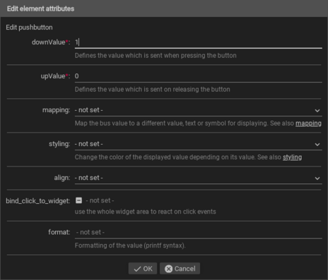
The behaviour and appearance of the PushButton widget can be influenced by using certain attributes and elements. The following tables show the allowed attributes and elements and their possible values. The screenshots show, how both can be edited in the editor.
Attributes underlined by ….. are mandatory, all the others are optional and be omitted.
Allowed attributes in the PushButton-element
Element |
Attribute |
|||
|---|---|---|---|---|
Name |
Content |
Description |
||
pushbutton |
downValue |
string |
Defines the value which is sent when pressing the button |
|
upValue |
string |
Defines the value which is sent on releasing the button |
||
mapping |
string |
Map the bus value to a different value, text or symbol for displaying. See also Mapping |
||
styling |
string |
Change the color of the displayed value depending on its value. See also Styling |
||
align |
left, right or center |
|||
flavour |
string |
Selection of a display variant. See also Flavour. |
||
bind_click_to_widget |
true or false |
use the whole widget area to react on click events |
||
class |
string |
Add this value to the CSS class so that it can be formatted by a user provided style sheet. |
||
format |
string |
Formatting of the value (printf syntax). |
||

Allowed child-elements and their attributes
Element |
Attribute |
|||
|---|---|---|---|---|
Structure |
Name |
Content |
Description |
|
|
colspan |
decimal |
Amount of columns this widget should be wide. |
|
colspan-m |
decimal |
Overrules the amount of columns on a medium screen. |
||
colspan-s |
decimal |
Overrules the amount of columns on a small screen. |
||
rowspan |
decimal |
Amount of rows this widget should be high. |
||
x |
string |
Horizontal position of the widget for 2D pages. |
||
x-s |
string |
Horizontal position of the widget for 2D pages on a small screen. |
||
x-m |
string |
Horizontal position of the widget for 2D pages on a medium screen. |
||
y |
string |
Vertical position of the widget for 2D pages. |
||
y-s |
string |
Vertical position of the widget for 2D pages on a small screen. |
||
y-m |
string |
Vertical position of the widget for 2D pages on a medium screen. |
||
z |
string |
Reserved for future use. |
||
width |
string |
Width for the widget for 2D pages. |
||
width-s |
string |
Width for the widget for 2D pages on a small screen. |
||
width-m |
string |
Width for the widget for 2D pages on a medium screen. |
||
scale |
true or false |
Enable/Disable scaling layout values relative to backdrop on 2d pages (default: true). |
||
scale-s |
true or false |
Enable/Disable scaling layout values relative to backdrop on 2d pages on a small screen (default: true). |
||
scale-m |
true or false |
Enable/Disable scaling layout values relative to backdrop on 2d pages on a medium screen (default: true). |
||
Element |
Attribute |
|||
|---|---|---|---|---|
Structure |
Name |
Content |
Description |
|
|
name |
string |
Name of the icon registration. |
|
type |
string |
|||
flavour |
string |
Selection of a display variant. See also Flavour. |
||
color |
string |
Color of the icon in CSS notation (e.g. #1188FF). |
||
styling |
string |
Change the color of the displayed value depending on its value. See also Styling |
||
class |
string |
Add this value to the CSS class so that it can be formatted by a user provided style sheet. |
||
|
string |
Text to display a label for the widget. |
||
Element |
Attribute |
|||
|---|---|---|---|---|
Structure |
Name |
Content |
Description |
|
|
transform |
string |
Transformation of the bus system value to be shown. |
|
mode |
disable, read, write or readwrite |
“disable” deactivates the communication, “read” will only fetch data from the backend, “write” will only write to it and an address with “readwrite” will be both, read from and written to. |
||
variant |
string |
|||
format-pos |
decimal |
Position for format string when multiple addresses are used. |
||
selector |
string |
Only MQTT: JSON selector |
||
qos |
decimal |
Only MQTT: QoS |
||
retain |
true or false |
Only MQTT: retain flag |
||
ignore-error |
true or false |
Only MQTT: ignore decode errors. |
||
|
string |
The GA (like: 12/0/7) for KNX-backends, the item name for openHAB-backend or the MQTT topic |
||

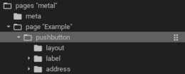
Elements in the editor
Examples
It is possible to manually edit the visu_config.xml and add an entry for the PushButton widget.
Caution
Make sure that you only use UTF-8 encoded characters by settings the encoding in your XML-editor to UTF-8 mode!
Footnotes