XML-Structure
An XML file consists of various “elements” that together represent a tree. An element can include other elements. Via “Attributes” an element can accept values. Some of these attributes must be assigned.
The Header of visu_config.xml
The configuration file always starts with the following two lines:
<?xml version="1.0" encoding="UTF-8" standalone="yes"?>
<pages xmlns:xsi="http://www.w3.org/2001/XMLSchema-instance" design="pure" xsi:noNamespaceSchemaLocation="visu_config.xsd">
The following settings are relevant in the second line:
Option |
Description |
Values |
Necessary |
|---|---|---|---|
|
This option sets the default design to apply to the visualization |
pure, metal, discreet, discreet_sand, discreet_slim, alaska, alaska_slim |
YES |
|
This option can be used to set the time after which a particular page is returned |
any value in seconds |
NO |
|
This option allows you to specify which page will be displayed after |
Specification of the page ID eg. “id_1” or page name e.g. “Main” |
NO |
|
This option sets the backend to use - overriding the information sent from the server |
|
NO |
|
URL of the knxd login resource |
NO |
|
|
URL of the MQTT login resource |
NO |
|
|
Path to the openHAB REST-API |
Usually |
NO |
|
Deprecated, only for openHAB: URL of the connection to the MQTT broker web sockets |
NO |
|
|
Deprecated, only for openHAB: user name |
NO |
|
|
Deprecated, only for openHAB: password |
NO |
|
|
Version of the CometVisu-library. This value is only required for the upgrade script. |
The CometVisu version 0.12.0 uses the value |
YES |
Next in the visu_config.xml within the meta tag are all definitions for plugins, mappings, stylings, icons and the status bar. The correct order must be adhered to!
The following is an overview of the options in the meta-tag.
Include additional files
Option |
Description |
Values |
Necessary |
|---|---|---|---|
|
With this option additional files (CSS or Javascript) can be loaded |
Path to the file |
NO |
<meta>
    <files>
        <file type="css">resource/config/media/style.css</file>
        <file type="js" content="plugin">resource/config/media/MyCustomWidget.js</file>
    </files>
    ...
</meta>
see also Change individual widgets through CSS classes and Write your own widgets via plugins.
Plugins
Option |
Description |
Values |
Necessary |
|---|---|---|---|
|
With this option the plugins are included. Here the name of the plugin is entered. For each plugin such an entry must be created. |
z.B. clock or diagram |
NO |
<meta>
    <plugins>
        <plugin name="clock"/>
    </plugins>
    ...
</meta>
Mappings
Option |
Description |
Values |
Necessary |
|---|---|---|---|
|
This option defines the name of the mapping. This is also displayed in the web editor with corresponding widgets. |
e.g. Name |
YES |
|
This option assigns a name to a value. For every possible value, such an entry must be created. |
e.g. Stop |
YES |
<meta>
    ...
    <mappings>
        <mapping name="Start/Stop">
            <entry value="0">Stop</entry>
            <entry value="1">Start</entry>
        </mapping>
    </mappings>
    ...
</meta>
Stylings
Option |
Description |
Values |
Necessary |
|---|---|---|---|
|
This option defines the name of the styling. This is also displayed in the web editor with corresponding widgets. |
e.g. name |
YES |
|
This option assigns a color to a value. |
e.g. red |
YES |
<meta>
    ...
    <stylings>
        <styling name="RedGreen">
            <entry value="0">red</entry>
            <entry value="1">green</entry>
        </styling>
    </stylings>
    ...
</meta>
Icons
Option |
Description |
Values |
Necessary |
|---|---|---|---|
|
This option defines the name of the icon, which is located under the directory specified in uri. The icons defined in this way can then be accessed via the name that is easier to remember. The directory specification in the example is relative to the CV installation. Here, the icons were previously stored in a separate subdirectory. |
e.g. |
NO |
<meta>
    ...
    <icons>
        <icon-definition name="Icon1" uri="./icon/subfolder/icon1.png"/>
    </icons>
    ...
</meta>
Hint
If the icons have been uploaded with the Manager they are stored in the path
resource/config/media/. An uploaded icon with the filename logo.svg kan be included with the following
line: <icon-definition name="Logo" uri="resource/config/media/logo.svg"`.
The path ``resource/config/media/ is valid for CometVisu versions >=0.11.x. For versions <=0.10.x the path
config/media/ is valid.
Templates
In the meta area, templates for frequently used configuration sections can be created. In general, one would like to show e.g. his heating in every room in the same way. However, this can consist of several widgets, e.g. a slider for displaying and operating the valve position, an info widget for displaying the current actual temperature and an InfoTrigger widget for the current setpoint temperature. This structure is the same in every room, only the used address changes. With a template you have to write this structure only once and can reuse it in every room.
In the template definition, placeholders are used for variables, which are then replaced by the corresponding values when using the template. The following example shows how to define and use a template.
<pages>
    <meta>
        <templates>
            <template name="Heating">
                <group name="Heating">
                  {{{ additional_content }}}
                  <slide min="0" max="100" format="%d%%">
                    <label>
                      <icon name="sani_heating" />
                      Heating
                    </label>
                    <address transform="OH:dimmer" variant="">{{ control_address }}</address>
                  </slide>
                  <info format="%.1f °C">
                    <label>
                      <icon name="temp_temperature" />
                      actual value
                    </label>
                    <address transform="OH:number" variant="">{{ currenttemp_address }}</address>
                  </info>
                  <infotrigger uplabel="+" upvalue="0.5" downlabel="-"
                               downvalue="-0.5" styling="BluePurpleRedTemp"
                               infoposition="middle" format="%.1f °C" change="absolute" min="15" max="25">
                    <label>
                      <icon name="temp_control" />
                      setpoint
                    </label>
                    <address transform="OH:number" variant="">{{ targettemp_address }}</address>
                  </infotrigger>
                </group>
            </template>
        </templates>
    </meta>
    <page>
        <page name="Living room">
            ...
            <template name="Heating">
              <value name="control_address">Heating_FF_Living</value>
              <value name="currenttemp_address">Temperature_FF_Living</value>
              <value name="targettemp_address">Temperature_FF_Living_Target</value>
            </template>
            ...
        </page>
        <page name="Kitchen">
            ...
            <template name="Heating">
              <value name="control_address">Heating_FF_Kitchen</value>
              <value name="currenttemp_address">Temperature_FF_Kitchen</value>
              <value name="targettemp_address">Temperature_FF_Kitchen_Target</value>
              <value name="additional_content">
                <text><label>Heating Kitchen</label></text>
              </value>
            </template>
            ...
        </page>
    </page>
</pages>
Hint
The templates use mustache.js. For more information, the mustache.js documentation can be consulted.
As an alternative to the example above, the content of the template can also be swapped out to an external file.
<pages>
    <meta>
        <templates>
            <template name="Heizung" ref="resource/config/media/heating.template.xml"/>
        </templates>
    </meta>
    <page>
        <page name="Living room">
            ...
            <template name="Heating">
              <value name="control_address">Heating_FF_Living</value>
              <value name="currenttemp_address">Temperature_FF_Living</value>
              <value name="targettemp_address">Temperature_FF_Living_Target</value>
            </template>
            ...
        </page>
        <page name="Kitchen">
            ...
            <template name="Heating">
              <value name="control_address">Heating_FF_Kitchen</value>
              <value name="currenttemp_address">Temperature_FF_Kitchen</value>
              <value name="targettemp_address">Temperature_FF_Kitchen_Target</value>
              <value name="additional_content">
                <text><label>Heating Kitchen</label></text>
              </value>
            </template>
            ...
        </page>
    </page>
</pages>
resource/config/media/heizung.template.xml<group name="Heating">
{{{ additional_content }}}
<slide min="0" max="100" format="%d%%">
<label>
<icon name="sani_heating" />
Heating
</label>
<address transform="OH:dimmer" variant="">{{ control_address }}</address>
</slide>
<info format="%.1f °C">
<label>
<icon name="temp_temperature" />
actual value
</label>
<address transform="OH:number" variant="">{{ currenttemp_address }}</address>
</info>
<infotrigger uplabel="+" upvalue="0.5" downlabel="-"
downvalue="-0.5" styling="BluePurpleRedTemp"
infoposition="middle" format="%.1f °C" change="absolute" min="15" max="25">
<label>
<icon name="temp_control" />
setpoint
</label>
<address transform="OH:number" variant="">{{ targettemp_address }}</address>
</infotrigger>
</group>
Structure of the visu pages
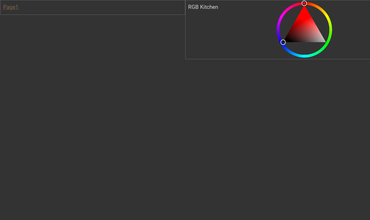
First, a page must be created as the start page. This happens with the topmost container. All other widgets and pages are inside this main page. The position of the elements is processed from top to bottom.
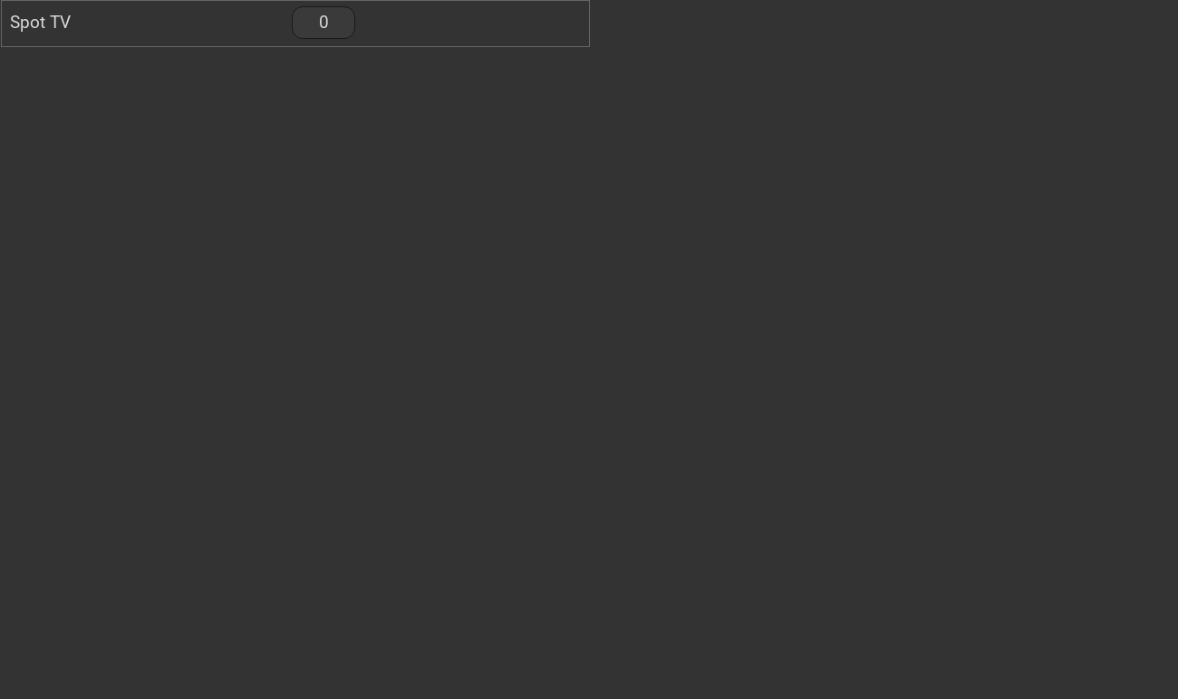
This looks like this:

Mainpage with link to the subpage

subpage
...
<meta>
    <plugins>
     <plugin name="clock"/>
    </plugins>
</meta>
...
<page name="Mainpage">
   <page name="Page1">
       <switch on_value="1" off_value="0">
          <label>Spot TV</label>
          <address transform="DPT:1.001" mode="readwrite" variant="">1/0/5</address>
       </switch>
   </page>
   <colorchooser>
      <label>RGB Kitchen</label>
      <address transform="DPT:5.001" mode="readwrite" variant="r">1/2/59</address>
      <address transform="DPT:5.001" mode="readwrite" variant="g">1/2/60</address>
      <address transform="DPT:5.001" mode="readwrite" variant="b">1/2/61</address>
   </colorchooser>
</page>
This little example creates a main page named Start page. On this home page, a link to a subpage named Page1 will be created. On this subpage, a button named Spot TV will be added to the top. Next, the color chooser named RGB Kitchen will be added to the main page.
With this structure arbitrarily complex page structures can be created. For a description of the individual widgets with their associated XML codes, see Widget Summary
In the last line of the config the tag has to be closed. Therefore the following entry has to be inserted at the end of the file:
</pages>
This completes the visu_config.xml and can be transferred to the server.